Friday, February 26, 2010
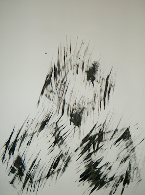
"We Were Separated At Birth" >>> Self Portrait Process

"The Weekly Lectures" >>> Lecture 11 & Speaker

Thursday Lecture # 11
Wednesday, February 24, 2010
"Gregory Crewdson" >>> Artist Research Paper
One of the most unique American photographers alive, Gregory Crewdson publishes fantastic images. It is easy to spot out his from the others. Each and every one of them has a surreal story behind them, which is what makes his photos so interesting. You would never see anything similar to his photographs in real life, but you would possibly see them every time you close your eyes to dream.
Gregory Crewdson was born on September 26, 1962 in Brooklyn, New York. This American photographer began loving pictures at a young age. When he was only ten years old he went to the Museum of Modern Art and came across some photographs by Diane Arbus. After this encounter, he loved photography. When he was sixteen he played in a band called The Speedies, with their first hit being a song about photos. Years down the road he attended State University of New York, and received a Bachelor of Arts in photography. Shortly after this, in 1988 he received a Master of Fine Arts in photography from Yale University. Gregory Crewdson then followed his dreams and began teaching college students the art of photography. He has been a professor at many colleges including Sarah Lawrence, Vassar College, and Cooper Union. He currently teaches at the same college he graduated from, Yale University. He has been a professor at Yale since 1993 and is still shooting his wonderful scenic pictures.

Gregory Crewdson is best known for his dream-like photographs of staged homes and neighborhoods. A series of the artwork “Hover” were pictures of very strange situations. His pictures have people positioned in odd places and doing strange activities. To shoot any of his pictures, a huge stage and many crewmembers are needed. He does not work in a studio, but on a on a sound stage. He has a set designer, an art director, a lighting tech and even a director of photography. The picture with the boy standing underneath the bridge is one of Gregory Crewdson’s most famous photographs. It seems simple, a boy underneath a bridge looking into the foggy distance. But this picture, and all of his others, is not taken in just one click. He had seen this railroad bridge in Massachusetts and began planning his picture scenery. Finally he hired forty people to set up the scene for this one picture. Everything in this picture was something he made happen, none of it was luck. The lighting in the picture comes from cranes and the fog is coming from hidden machinery. But this picture was a very simple shot compared to his other work. Sometimes he closes down streets and roads, just to take a single picture. His new book, “Beneath The Roses”, also includes pictures where he created rain and even house fires. Another effect that Crewdson tries to establish is to make the photographs look like they are paintings. The dream-like and unrealistic qualities in his pictures definitely help to achieve this effect.

Gregory Crewdson is a very unique and original photographer. There are absolutely no other photographers that have the gift he has. Most photographers take a picture without creating the smoke and fires in the background. But not Crewdson, he is the reason for his photographs, not nature. Because of the techniques Crewdson uses in his pictures, the viewer can see many different things. The audience has to decide what is real and even what is surreal. His pictures make the audience and all of the viewers feel like they have fallen into his dreams. They are just stuck, lying in the middle of the picture. When any viewer looks at one of Crewdson’s pictures, they get a feeling and a sense of desperation inside of the picture.

Gregory Crewdson is an outstanding photographer, who is still shooting his surreal pictures. They look like something Steven Spielberg would produce if he were a photographer. I really like all of his work. They are all dark and gloomy, creating a deep picture down inside my head. Some of them are a bit creepy as well. If I were to ever see a woman lying in the middle of a dark room, I would be very frightened. And I think that is one of the things that he wants to go through your mind as you look at his pictures. I love the lighting and other special effects that are used in his pictures. Some of them are very noticeable that they were set up on stage, but some of them look like the scenes had already appeared that way. It is very hard to get a good shot inside of a house, but he does an amazing job at getting the perfect one. I also love how all of his pictures look like they are paintings. They are perfectly airbrushed and the colors that pop in the pictures do not seem like anything a camera could capture. I would love to have a piece of his work hanging in my future home, but his tend to be a bit too expensive for me, around 150,000 dollars.
Sources:
http://www.whitecube.com/artists/crewdson/
http://www.smithsonianmag.com/arts-culture/gregory-crewdson.html
http://metroartwork.co m/gregory-crewdson-biography-artwork-m-61.html
http://www.luhringaugustine.com/index.php?mode=artists&object_id=66&view=bio
http://bombsite.com/issues/61/articles/2090
Sunday, February 21, 2010
"rhythm" >>> Fake A Cubist Painting

Look at my final painting. What do you see in it? Maybe some circles, rectangles, triangles, and squares? Yes all of these geometric shapes are definietly there. But do you notice any actual objects in the painting?
"Mocking Marks" >>> Marks, Music, And Words Process


