Saturday, January 30, 2010

"Text As Texture" >>> 2D Project 1, Part 2

In class on Tuesday we went around critiquing everybody's projects. It's very interesting seeing everybody's perspective on your own project. I was told many good things about my Text As Texture. I am not sure on who critiqued mine, but I know it was a girl! She noted that I was the only person to use the actual newspaper to become 3D, which really made mine pop and stand out. She also said I had a great balance between black and white texts. It was very easy for her to tell that mine was closure and she also believed I picked the best texture for my final project. But I only got one negative statement, which was that the edges of my paper were slightly uneven. But other than that, she seemed to love it.

And I loved this part of our project. It was much more hands on, which is what i love...things that are more with designing than drawing. On top of the fact that I think I have an obsession with black and white things. I actually finished this project on a saturday!!! ya i couldn't believe it either! I started it earlier in the day and took a few breaks but i was obsessed with finishing it. And I finally did, and I am extremely happy with my results.

This is the front view of my Text As Texture. I ended up redoing my entire text part of this. I made it into an 8x8 sheet. I love how my text turned out. You can see only parts of words, and some are black, while some are white.


The side view of my project. I love the shadows it makes. I feel like it makes it very 3 dimensional, and jump off the page even more.
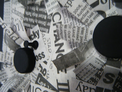

And finally a close up of my project. I used water bottle caps and pushpins. It looks like flowers trying to emerge from the caps.


My accordion book came out really cool! Gluing it was simple but making it into a nice square was a little more difficult. Especially for the textures I had made. Since i have 3D textures to begin with, it makes my book kind of lop sided :( but i fixed it as best as possible. I also added a little more on to it. I made a "front cover" and put a ribbon on it so it can be easily closed without it flopping open every five seconds. It ended up having 12 textures inside if it. And I feel like I definitely chose the best texture for my project.


"Extra, Extra, Read All ABout It" >>> Text As Texture Process


Today I worked on my text as texture project. I ended up completely redoing my text side of it. I made it larger to an 8x8. Also, Bill said before the background was lost behind the raised parts of the texture. So I changed up the background by adding darker texts and putting them in all sorts of directions.

I am absolutely in love with this one now. I think its the neat shadows it creates. I can''t wait until the finished product!! i got a new glue gun today too! i was excited. i finally came so my mom and i went on an art shopping trip!

but anyways. back to my project. it has come along and i like it as an 8x8 much more than 6x6. But I am still having trouble with the spray adhesive. I just dont like that stuff very much. It is hard to glue it down perfectly straight.

Friday, January 29, 2010

"What Is Art" >>> Lecture 1


It was the first day of Art Lecture. I must say, there is much debate on what is and what is not Art. Most of the things we viewed in class was not art at all to me. But everybody has there own ways of looking at it. I agree that most everything you see daily has a "process of art" to construct or create that object, but once some things are created, it is only an object and nothing more.

This is a different picture than we viewed in class. But it looks somewhat the same, with the "white" tree. And NOO it is not art. It might be art, but if this is art than that means absolutely every other plant it. And that is definitely not true.


P.S.
In case you are wondering, I was fixing up my blog to make it more organized. This is the same paragraph I stated the first week of school, I only posted it to its own blog, so that it would no longer be combined with the quilt/painting. And yes, I also changed my background. I realized my last one was very hard to see the pictures. Hopefully this one works out better!

"And On..." >>> Module Madness Process

Today i finished a lot more on my star than i thought i would. On thursday i began paper macheing my star but only finished half of it. today i finished the rest of the paper mache. And then again i noticed it was not perfect, there were parts of the star taller than others and some that were lower than others. i had to patch them all and eventually it become very flat! It looks incredibly better than now than when it was not covered with newspaper. but its just hiding flaws...dont let it fool you! haha


I then out hooks on the back of the star. But i have no idea which way i want ti hang it yet. so i put two different hooks on it. i dont think i will know until its covered with mirrors. Im hoping these hooks are going to hold up good. :/ i realized that i probably should have put hooks on it before i began to make it 3D. i could no longer get inside of the star when i attached hooks. so i poked a hole in with wire, hot glued it inside as best as possible, and smothered it with hot glue on the outside. So it should hold up! ill pray for it! but the mirrors arent that heavy so it should all be good....


"And the Story Goes On" >>> Module Madness Process


Tuesday in class I got a lot done. My star finally became 3D!! This was very time consuming, and needed much patience, which i do not have. I realized the sides of my star were not coming to a point, AT ALL. I was so nerve-wracked trying to make the points actually come together. I had to measure every piece about five different times. And I realized one side had to be longer than the other side, after about half of them were cut. So I ended up needing another foam board. i was seriously about to throw it away and make it out of wood. I never thought it was going to look like a star, but i ended up sticking into it, and i worked through my many problems. I finally got somme of the sides to make to all the way to the center of the star, but then the side was about 2 inches lower than where they were suppose to be. So I cut many small pieces in odd shapes, and glued them in to fill in the gaps. I looked horrible by the time I made a point, but I was just happy it looked like a star.

Thursday, January 28, 2010

"Putting Our Heads Together" >>> Human Dot Brainstorming

(Team Picture Coming soon)

The Team Members:


We began brainstorming for our Human Dots on Tuesday. We came up with lots of good ideas too!

a bunch of ways for us to display the dots:
holding balloons at different heights and taking a picture from above, make our bodies white and the background white creating black dots with white outlines, using a projector and face paint we will make dots pop out for an action clip, project dots onto a screen and place the humans inside, crouch down and become a dot, cover face with baby powder and paint black dots on face, wear all black and allow humans to become dots, dirty black feet making circles, piles of leaves bursting into dots, lay in inter-tubes in the water, use umbrellas, drop balls from above and make them splatter into a dot when they land.


our dots in production:
using a photograph, video, skits, or just simply drawing them.


different backgrounds:
white walls, black sheet, white sheet, lightly colored grass, water

Tuesday, January 26, 2010

"Texting Away" >>> Text As Texture Process

This morning I began painting my dots for my text as texture. They all look great now, and are very similar sizing as my dots from my sketch. I used water bottle caps and push pins.


After my dots dried I placed them on my favorite sketches.


I liked this one....


...But this one is my favorite.
It is a bad picture but I plan to do my text as texture with this one. I have to redo it, and make the background slightly darker so it is seen on the page as well, and its not just the dots jumping off the page.


and i am just in love with the pop up ones. So i did not use these two. I still liked them, but the pop up ones are much different than any i had seen in class.

"Once upon a Time" >>> Module Madness Process

I talked to my peers and to the teachers, and the star seems to be at the top of everybody's list. I made a sketch of what I am hoping the star will end up looking like. I was originally planning to make the entire star out of paper mache. But then I realized I would not have a very solid base and backing for it to hang on the wall. So I decided to use a foam board. I was really wanting to use wood, but I have a tight budget and the foam board was much cheaper.

But anyways, today in class I accomplished a lot. My star is finally beginning to look like a star. I began cutting my edges with a razor blade but the edges were beginning to become very rough. They were not fine or straight, like a star should be. It is suppose to be perfect like you are wishing for your dreams. So I began using an electric saw. The edges were much finer after I experienced with the saw. It was quite frightening and difficult since I had to make both edges on each piece slanted. I cut I bit too much off of some if the pieces, and later had to stuff the gaps.


"Dot, Dot, Dot" >>> 2D Project 1, Part 1

These are my final four dots that will be turned on during Thursday's class day. I really enjoyed this part of the project. It is nothing like anything I have ever done. It taught me many things, of coue one of being patient, and as clean and precise as possible. But it taught me many different designs and ways to lay out objects, kind of in the printing industry. You have to think of as many ways possible before finding your final decision.


I did many steps to them to make the dots as black as possible.
I colored them with marker.
Then I realized how hard it was to keep the paper super white, and had to redo my dots.
Then I painted the dots. Which was very hard to do, because I could not get very close to the edge, or paint would get on the white paper.
And spraying adhesive is also very tricky. It wants to stick on your hands more than anything else it seems.
But now there all done and sitting in my folder to turn in!


By the way...

My final dot sketch I am using for my text as texture is the one on the top left corner.

Monday, January 25, 2010

"100 pieces of ___ on the floor" >>> Module Madness

Class on Thursday the 21st was very interesting. We had to display our 100 objects on the floor in any manner you wished. Well i happened to not have my 100 objects with me.

I am not sure if what I am doing for my project. I have tons and tons of ideas that I am thinking about doing. My first idea is to make a 3d star with shattered mirror on top of it. I also want to make a boat out of cork bottles, but I only own about 20 corks, and I am not sure where to get 80 more this quick! I was also thinking about making a lap top out of floppy disks, a tree out of leaves, or a jumbo flower out of crumbled pieces of tissue paper.


I am not sure of which one to choose, so I did not have my 100 objects in class. I am still completely stumped of what my project will end up being, but my favorite idea that I have is to make the star with mirrors, so I used newspapers cut into 100 pieces and displayed them into a star.

Our next task was to choose someones else's 100 objects and rearrange them however. These buttons began as an octopus, which i liked more than my creation. I saw the light colors and thought of a babies room, then thinking about a specific object...a baby bottle. It turned out very cute!

"Two's a Crowd" >>> top 2 textures


While looking through my twelve text as textures, I realized how hard it was to choose my favorite two. So, I decided to choose my favorite 2 D and favorite 3 D texts.

It was a very hard choice out of my flat textures. But this one integrates with the dots in a lot better fashion than any other flat textures do. The text is positioned at an angle running off the top right corner of the square. I also wrote the word GESTALT in the texture, using clips of letters from the newspaper. I also like how some of the larger text is noticeable but not able to read completely. It cuts off the page making you want to keep reading, causing it to be partially continuance.


It is 3 dimensional. I mixed dark and light texts often in this texture. Again, some of the larger words are not fully readable, but still very eye appealing. I rolled pieces of newspaper and glued them down around where a dot will be placed. It will cause the dots to jump off of the page more. There is also a space in part of the circle. This is to help create the visualization of the missing dot. I love this texture, its very appealing to the eye and goes with the dots in a wonderful way.

"Text It, Don't Say It" >>> My 10 Textures

I really enjoyed making my text as textures, so I ended up making more than ten. Every one of my text as textures is very different. They all have many different text sizes in them. They all go in different directions as well. I made some of them 3 dimensional. I ended up making a total of twelve text as textures. I did not realize it, i just starting creating and ended up with more than required! My favorite ones are definitely the ones that are 3 D. Lots of them flow with my dots as well. I enjoyed mixing dark and light pieces of newspaper together. And also mixing large texts with smaller texts.

(The description od the textures is below each image)....sometimes it gets confusing!

I tried to use smaller print and clipping in this texture. It does not flow with my dots entirely but I love the black lettering and the darker white pages. And many of the words are actually very readable in this texture.


I love this texture. I started getting bored by the same flat ones over and over, so I decided a pop up one would be interesting. When dots rest in the spaces it will really help them jump of the page. I also love all the shadows that this texture ends up creating.


This is probably my favorite one. I curled strips of newspaper with the end of a paintbrush. And then glued them in a circle with the dots being placed in the middle. I like how you also look at the background of the texture, and not only the 3D part. And the use of darks and lights here was perfect, as well as not being able to read every one of the larger prints.


I found barcodes in one section of the newspaper and though it would be very original to use them in some way. I wanted them to be 3D as well so i crumbled a piece of newspaper and stuffed it below each barcode. I like it, but it does not do much to help with my dots. It kind of only looks like something from the grocery store.


THis is my favorite flat texture. It works great with my dots. Since they move Northeast i would say it keeps the dots moving off the page, just as the text is. And i also hid the word GESTALT into the texture. It is slightly hidden but still goes in the flow with the dots.


This texture helps with the flow too. Again it movies to the top right corner, just as my dots do.

The first texture I made. To me it is a bit boring after looking at my others, but i like the words that are used in it.


These are little triangles formed into a continuing circle. It was meant to make your eyes notice the circle very easily, but it became more of a blob. But i really like how the larger text is unable to read.


This one also works very well with my dots. There are three circles where the dots would lay and the circle keeps continuing on, making yourself focus in on my dots.

After noticing this one was plain (and also had a blue spot on it) i decided to add another touch. So I crumbled circular newspapers and placed them where each dot should lay. And with my dot sketch im using, one dot is missing, so there is an empty newspaper in its place. It seems like it will work well with my dots, but the others are a bit more eye appealing.


Made from magazine articles this time. I think i like newspapers more, but decide d to use true black and white text, instead of the off white newspaper articles.


I made this one more as a collage and ripped the newspaper. It works well with my sketch and focuses yourself on the background. And again, i like how not every larger word is readable. Except for "war" in the center of the text. I look at it as a fight between the dots and one of them did not have a ball for there canon. :)