Sunday, October 23, 2011

Cut out portrait


We had a homework assignment to cut shapes to form a portrait BlogBooster-The most productive way for mobile blogging. BlogBooster is a multi-service blog editor for iPhone, Android, WebOs and your desktop

Cut out


We used the model to cut out the shadows with three shades of paper. BlogBooster-The most productive way for mobile blogging. BlogBooster is a multi-service blog editor for iPhone, Android, WebOs and your desktop

Life drawing


Drawing the model. BlogBooster-The most productive way for mobile blogging. BlogBooster is a multi-service blog editor for iPhone, Android, WebOs and your desktop

Muscles


We didn't have the model to draw from so we practiced drawing the hips of the model. BlogBooster-The most productive way for mobile blogging. BlogBooster is a multi-service blog editor for iPhone, Android, WebOs and your desktop

Blocked drawings


We practiced drawing by using geometric figures. BlogBooster-The most productive way for mobile blogging. BlogBooster is a multi-service blog editor for iPhone, Android, WebOs and your desktop

Thursday, September 15, 2011

Life drawing - human hand


Our model got sick so we were stuck drawing our own hand. We still used the box analysis method.

Tuesday, September 13, 2011

Found like type


The alphabet!

(very bad picture..it is extremely squished)

Life drawing 2


(again oddly squished)


We focused mainly on the proportions of the model in class. My proportions were much mure accurate this time


Life drawing 2


 The method here we approached was drawing geometric boxes.


Wednesday, August 31, 2011

Playing With Type


A quick activity our typography class created. We each produced several letter squares and then combine dthem to form this piece for the wall.

Life drawing 2

Back in to life drawing..starting off with gestures to get back in the groove. We looked at them in class and he picked mine up and said "this is much closer to what y'all should be doing". I was very excited to hear that!!


The first 20 minute pose for the semester

Sunday, May 1, 2011

Life drawing - week 13


This week we used vine charcoal which I learned I do not like using but only drew one day. So didn't get many finished but this was my favorite.

Painring - self portrait


My self portrait on canvas. Oil on 18 x 24 inch. It has hidden word carves words and symbols that relate to my life


Thursday, April 28, 2011

Life drawing - week 12

This week we used ink to draw with.
This is with sharpie. We didn't have a model so we drew classmates. This was my favorite with sharpie.
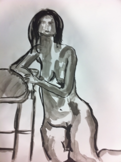


This was using india ink. It's more of a water color since I used mainly water to paint with.


This was using India ink as well but I changed my method. I really like this way and would continue to use ink

Tuesday, April 19, 2011

Graphic design - trademark

Here is the logo I created for my Graphic design class. It is a fake company called Top Notch that makes contemporary furniture. I went through several ideas for this logo, and really like how simple and effective it is. It is suppose to look like a chair and a t and n at the same time. 

Thursday, April 14, 2011

Life drawing - week 11


This week we used colored pencils to draw with. I like how precise and accurate you can get with them as opposed to the messiness of charcoal. The picture came out a bit blurry :/


This was the longer one Hour drawing done on colored paper.


This is another hour pose on colored paper from Thursdays class.

Monday, April 11, 2011

Digital art - Photoshop portrait

We had to draw a student in out class using photoshop. Very easy to do, but id rather stick to the pencil and paper style of drawing.

Friday, April 8, 2011

DIgital Art - impossible landscape

We had to create a new photograph using multiple pictures of landscape that would be impossible to find. 

So mine is of a beach with snowy mountains in the distance, and a sailboat pulling a wakeboarder. 


These are the images I used to make my photo


Digital art - Photoshop Introduction

We were introduced to Photoshop by making these images. We just took a photo from the internet applied different affects, and then recorded those steps to make the second image have the exact same effects. 

Life Drawing - week 10 in class

This week we used conte to draw with instead of charcoal. I liked it, but would need some more practice with it. 


This one used black and sanguine conte, which I do not really like the look of mixing them, but Lawler mentioned this might be my best drawing I have done all year...which I am not sure that I agree.


This one was done with only sanguine conte, which I really like the looks of. This drawing turned out nicely, I think conte is a good choice of material for me to use. I did not get to finish the background above her completely though. The body turned out very nicely, but I still need help with faces. :(

Wednesday, April 6, 2011

Painting - original of two people


My painting of two people in a room which needed to be original. I am kind of wishing I would have done this painting in full color....but I am still happy with it. Still debating on the title of the painting